iDesign: Book Jacket for Personal Journal
For the final project I decided to design a book jacket for my personal journal. It’s really fitting in a way that for my last class session and my last presentation, I’m presenting a book jacket for a journal which I started because I had so many nerves about leaving for school. At first I thought that the design would come simply and naturally since it could be anything that had to do with myself. Then I realized that the process was similar to the logo design process – how do you sum up yourself in a single image?
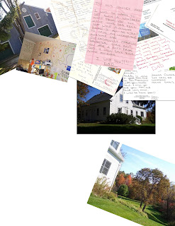
 I began with trying to collage my life. I already had a lot of images scanned on my computer so I started there. The idea was to make it look like I threw a bunch of memories on the floor that would resemble snapshots of my life. I moved away from this idea because I just wasn’t happy with how it was turning out and I didn’t think I had enough additional images to incorporate.
 From there I embraced the concept of this being a traditional journal. I wanted the image to have a book-bound feel, so that even though this is a word document on my computer, it is still a typical journal in the sense that although it isn't hand written, I still spill my secrets out onto a canvas. This thought of having my feelings written out on a page, gave me flashbacks to the hand written journals of my past and trying to keep it safe from the prying eyes of my brother. That is where I got the idea to recreate the Password Box that pops up every time I open the document. The following is the first draft of the cover:
Afterwards, I realized it was pretty funny I went from a collage idea (in which I was spilling out a whole bunch of personal images) to a design where at first it seems as if I’m blocking viewers out of the whole document. That thought brought me to the next edit where I added in the password bullets and the mouse cursor into the password box to further emphasize the point that the viewers were being granted access to something that is normally blocked off to everyone.
As I continued working on the design, the rest of the concept took shape. Instead of the spiral bound edge, I brought in the three-hole-punch visual plus the bound blue strip. I really like how the crinkled paper turned out after playing around with gradients, embossing, and lighting overlays. I wish I could have figured out how to crinkle all of the images on top of the paper as well and hopefully I can accomplish that on my own after class ends.
FINAL IMAGES
Jacket Spine:
Cover:
Inside Jacket (Summary)
Inside Jacket (Author Bio)
Back Cover


