Thursday, April 28, 2011

Photoshop Final Project

Well, this project has turned into quite the journey. In the beginning and right up until now, the process has been one full of trial and error, numerous Google searches for answers, and plenty of redesigns. Working with a client as an individual is a new experience for me, and this one has been a fairly smooth back and forth. In other classes I have participated in projects that involved outside companies, but through each experience I was part of a group or the entire class had been involved. Knowing that this website was going to be for a real company that had a real purpose and a real need, was stressful but motivating. It kept me from cutting corners or deciding that something was "good enough". Working with Yahoo Sitebuilder was definitely the right choice both in regards to the Club's future maintenance of the site and my own process of designing. There was only one time I needed to know any sort of HTML code and that was during the extremely frustrating process of trying to incorporate the slideshow of pictures onto the site's homepage. So here is a little snapshot of everything from start to finish, even though the finish still isn't quite here.

The homepage and page templates went through metamorphoses:

This was the original homepage design


Then the header was moved to the top of the page and the contents was cleared in order to be input in Yahoo Sitebuilder. That way the Club could change that text if they wanted to. I also adjusted the size of the template and added space for a mission statement under the big picture box. This was done at the request of the Club.


 Then I experimented with some white designs to give them a comparison point


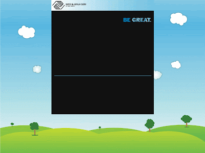
Went back to the black background but kept the boxes outlined in the sky blue.


Finally, the two bottom boxes were cleared and a single thin line was incorporated. The header box's color was also adjusted to blend more with the background of the site. This was the final homepage template design.


PAGE TEMPLATES:
The changes in page template followed the homepage changes for the most part


The sidebar box was adjusted and the header moved to the top of the page


The sidebar box became yellow in order to use more color. This is the final page template design.


BACKGROUND WORK (the space around the template)
The background was a tricky piece of the puzzle. At first the background was set to a darkish gray, but the site came off very drab... not really kid friendly. So then I had the idea to give it a splatter paint look... I deleted most of the attempts, but here is one that survived:

I really liked the concept of this, but after trying again and again to get it the way I wanted, it just wasn't coming out as well as I wanted it to. So I explored other options, but this is an idea I hope to return to in a personal project. Searching around for ideas brought me to an image designed by another graphic designer. I emailed him and he said it was fine to use it for the site and asked if I could include his website in the HTML in exchange.


The other photoshop work I did was in making the navigation bar buttons. I originally made the entire bar in photoshop and then realized that Yahoo Sitebuilder had other plans for me. So I went back and saved the buttons individually and worked them in using the NavBar creator. I made one inactive button, one rollover, and one active. Here they are individually:

The side bar buttons are on that yellow background so one of them is white and won't show up here, but here is the green rollover button:

My biggest challenge came in the form of the homepage slideshow. I tried importing a flickr slideshow but the result wasn't as professional as I wanted it to look. Whenever the user rolled their mouse over it, controls would show and it would link back to the flickr account. I tried making a movie in windows movie maker, but once again I had trouble with controls showing and the show not automatically starting when arriving at the page. Finally I gave in and learned how to use Adobe Flash. I ended up making a swf file but I couldn't import a swf into Yahoo. So I tried saving it as all sorts of different things: animated gif, wav, avi, etc., etc., I did a lot of Google-ing to try to find a solution. I came across one that said I could use the HTML from the swf file and insert that into Yahoo. So I opened the swf with Firefox which created another version of the file. Then I opened that version in notepad and lifted the HTML from there. Next I uploaded the swf to my Yahoo file manager and inserted the HTML in the Sitebuilder application. It took a while, but I got it to work!

Other features include the linked donation buttons which send users to a secured site to make donations through. I didn't have anything to do with the creation of the outside account, I simply created the button and link. Also, Yahoo has quite a few features built into the sitebuilder application. I added the Yahoo directions box really easily along with the contact us form and a registration form that is not being included right now. Both of the forms are linked to an email address which stores whatever people submit. Lastly, the color scheme was chosen to match the landscape background in addition to the Boys & Girls Club of America marketing guidelines.

For right now, the site can be found at www.joannaclarkmarketing.com. I'm not sure how long I'll keep it up there, but for now it has been useful while I design and the Club director looks over progress.


All-in-all I'm really glad this project fell into my lap. It still hasn't been decided if the site will actually be adopted by the Club, but even if it isn't, I'm really happy with how it has all come out and I feel much more comfortable and capable with my abilities. I hope to create a personal site in the future, and I imagine the process should go a bit more smoothly.

Friday, April 22, 2011

Like the Back of My Hand

Photoshop Exercise 5 
DESCRIPTION: Create an 8 x 8 inch flyer using color and a grid system to direct the viewers’ eye and to establish visual hierarchy. Select various tools and strategies from Photoshop to develop your composition. For instance, color shapes at various opacities can be added as another layer of information or parts of one image can be cloned into another. Attention will be given to effective use of typography, line, image, figure/ground relationships (open space) and experimentation. Use the whole page. Make sure your document is RGB and properly resized for the web before saving as a jpeg and uploading to the blog.

Process: 
1. Write a set of facts about your life, and create a photographic image of your hand. Other images can be used but your hand should be clearly represented.
2. Map your life onto the image of your hand. Position each element on a 30 or 45-degree angle. Use scale, position, color and transparency to organize the information to create visual interest.


Informational Graphic: The Diagram

Communication Design Project 3
DESCRIPTION: Using gathered facts design a creative and resourceful informational graphic. This could be based on your logo just created. The information presented will allow us to see relationships both in the content and the form. Time and motion should be considered as well.

Animation


Photoshop Exercise 4
DESCRIPTION: Create a short animation in Photoshop using type and image giving special attention to sequencing and transitions in terms of communicating a certain feeling or response in the viewer. For instance, transitions with a long fade in or fade out allow the viewer to spend more time with each sequence, or frame, and have a softer visual voice. Transitions that are direct have a louder voice. Sometimes visual interest can be created in juxtaposing these two ideas.


Motion, Time, Sound

Communication Design Exercise 3
DESCRIPTION: Create a composition using points, lines, and planes that implies motion, time, and sound.

Logo Design

Communication Design Project 2
DESCRIPTION: Develop a logo for an organization, company, or yourself. This symbol, or logotype, should be independent of time, and not based on fashion. It should be memorable and simple so coherent in composition that no part can be removed without diluting the whole message. No frills.

First Edit

Second Edit
Third Edit:


Final Product:


Aesthetics of Altered Media

Photoshop Exercise 3
DESCRIPTION: Create an image that represents layering, repetition, cloning, and experimental use of color through shapes. Express yourself through image only as “aesthetics of altered media.” Use of appropriation is encouraged.

Color and Value Grids

Communication Design Exercise 2
DESCRIPTION: Create two compositions using a grid. The first composition will be in color and will focus on the interaction of colors between each other and the overall feeling that the colors create throughout the composition. The second composition will be a value study of the first composition.


Typeface Poster

Communication Design Project 1
DESCRIPTION: Using visual concepts developed through the class exercise Emerging Letterforms into Compositions, design a poster that promotes a specific typeface. The poster will reflect the characteristics, or identity, of the typeface chosen, as well as communicate the feeling of that face. Patterns, modules, and figure-ground relationships developed in the class exercise can be utilized.

Two Images

Photoshop Class Exercise 2
DESCRIPTION: Find or create two photographs with contrasting meanings.Working in an 8-x-8-inch square, combine one or both images with a text. Crop and isolate elements of the text and image to bring focus to the form and message. Adjust the transparency of the elements in order to create visual relationships. Use transparency and layers to create a sense of movement or to enhance or contradict the spatial references in the imagery.


eMerging Letterforms into Composition

Communication Design Exercise 1
DESCRIPTION: Create a graphic from two letterforms using the principle of figure/ground relationships. Repeat graphic forms in a grid to create a visually interesting dynamic design.

The Medium is the Message

Photoshop Class Exercise 1
DESCRIPTION: Using image and text, create a clipping mask depicting the idea that the medium is the message. No Google or Bing images please. Before posting to our class blog, save the Photoshop file as a JPEG.


Thursday, April 21, 2011

Response 11_Photoshop

"Designers plagiarize, whether or not they call it "looking for ideas." This truth has been hammered home during the last six months as two nationwide campaigns, by respected agencies, have blatantly copied the work of lesser-known créatives."

While reading this article, I found myself a bit torn. Whether it be design, literature, research, film, or music... there are definitely some rules about plagiarism that are set in stone. I remember at one point early in my education (middle school-ish age) a teacher told us, "If it wasn't your own original thought, cite it." This type of sweeping statement is easy to make in regards to research papers or lit reviews when the author is working to build off of the research that came before. If this thinking were to be translated directly to design and the arts, then under every design there should be a list of all those pieces that influenced it, because I guess technically the designer built off of those ideas to arrive at the current work. Maybe that's why plagiarism in artistic communities is so dicey, because there is no such thing as a completely original thought. Everyone is influenced by what is around him or her. If a scientific paper were published with no cited sources, the community would immediately question its validity. If an artistic piece were published with cited sources, the community would immediately question its validity. Hmmh.

A blogger who writes the "Grammarist" wrote about the recent issue of Helene Hegemann and her use of "remixing" rather than plagiarizing in her prize winning novel. EHow wrote all about the different levels of "remixing" in films. Not only that, but every rap song that hits the top of the charts will undoubtedly have a hand full of remixes following in its wake. I guess what I'm getting at, is plagiarism in the arts is a hard topic. This website displays what seems to be obvious examples of plagiarism, but then I think - what's the difference between this and the remake of a foreign film? Or the remix of an old song? This all just seems to be a slippery slope.

Thursday, April 14, 2011

Response 10_Photoshop

I really enjoy the critique process. I was first exposed to group critiques last spring in my Intro to Digital Photography course. Before every class we would display the work we did for the week and then spend the majority of the 3 hour class talking about it all. The first few were awkward because no one wanted to potentially insult a classmate, but we all quickly learned that that was never the intent.

Yesterday I had a conference call with the group I'm working to make the site for (The Boys & Girls Club of New Haven, CT). It served as my first critique so far of the site and I got a lot of feedback from them. I had been working and interacting with the site so much that it was nice to hear from a couple of people who hadn't seen the site and who also had a vested interest in it. While working on the templates a couple weeks ago, I had my roommates look at them and give their opinions on the color and layout. Right away they suggested to give it more color which prompted me to add the landscape background. On the conference call yesterday, the Director of the Club suggested making the black template a bit smaller to show more of the background and the other person on the call suggested changing the black to a different dark color. So I definitely have a lot more work to do on the project and I'm looking forward to hearing what the class has to say tonight. Hopefully I have the chance to make the changes the Club suggested before the class has a go at it with their opinions.

In regards to the Design Process piece, I think this project is especially challenging because it isn't just designing a website... it's designing a website while learning how to make a website at the same time. In the beginning of the process, I was mapping out the design while trying to become familiar with the application I'm using, Yahoo Site Builder. It has definitely been a trial and error experience for parts of it, realizing the limitations of the program as well as the limitations of my own technical ability. In the same vein however, one of the Club's main requests was that they could easily learn how to make changes to the site themselves. So in a way, the fact that I have limited technical ability may work out in the long run because everything I'm doing is really straight forward and user friendly. Anyway, there's still a lot to be done so I better go and get to work on it!

Thursday, April 7, 2011

Response 9_Photoshop

This week I dove more fully into the website design project, so reading about the dos and don'ts of navigation was really helpful. Navigating through websites is something I have essentially grown up with. By the time the internet had proliferated through the country, I was right around the age that I could understand it all. Web navigation has become so second nature that there will be times I click through to a website from a Google search and within the first 3 seconds, decide if I'm going to engage with the site or simply hit back to the Google results and choose the next option down the list. The design and layout of a website is so crucial because there are literally billions of sites to compete with for user attention.

While speaking with the people I am designing for, they had pretty set ideas about page titles and where certain information will fall. Since they are apart of a larger nationwide association however, there are guidelines about how all Boys and Girls Club websites should look like. Now I'm trying to find a balance between following the guidelines laid out at the top level while still portraying the individual club's voice.

So as I read the chapters in Information Architecture and thought about my own design process, I began to think about what makes a good website in my own mind. I think the most important factor personally is having control over my own experience with the site; being able to decide how much time I am going to spend in order to get the information I need. I hate it when sites only have a video to explain something for example. By only presenting information in video format, the site is determining how long it takes for me to understand a topic. By having a video to supplement a textual explanation, I can scan the text and then decide if the video is relevant and worth my time. I also don't really like it when sites add pages that you have to "skip". I understand that sometimes it is a necessary evil... but if I am going to a site regularly then I start to develop a navigation routine, suddenly having extra pages thrown into the mix just to promote an event or an accomplishment is distracting and frankly annoying. This little bit of thinking led me to look further into examples of good and bad sites. The following links are to Time Magazine's list of 50 Best Websites in 2010 as well as Time's contrasting list of 5 Worst Sites. It's always helpful to learn what people are doing right and wrong!