Testing out some social plugins!
How about some inline tweet links?
Monday, April 30, 2012
Saturday, May 14, 2011
Communication Design Final - Book Jacket
iDesign: Book Jacket for Personal Journal
For the final project I decided to design a book jacket for my personal journal. It’s really fitting in a way that for my last class session and my last presentation, I’m presenting a book jacket for a journal which I started because I had so many nerves about leaving for school. At first I thought that the design would come simply and naturally since it could be anything that had to do with myself. Then I realized that the process was similar to the logo design process – how do you sum up yourself in a single image?
 I began with trying to collage my life. I already had a lot of images scanned on my computer so I started there. The idea was to make it look like I threw a bunch of memories on the floor that would resemble snapshots of my life. I moved away from this idea because I just wasn’t happy with how it was turning out and I didn’t think I had enough additional images to incorporate.
 From there I embraced the concept of this being a traditional journal. I wanted the image to have a book-bound feel, so that even though this is a word document on my computer, it is still a typical journal in the sense that although it isn't hand written, I still spill my secrets out onto a canvas. This thought of having my feelings written out on a page, gave me flashbacks to the hand written journals of my past and trying to keep it safe from the prying eyes of my brother. That is where I got the idea to recreate the Password Box that pops up every time I open the document. The following is the first draft of the cover:

Afterwards, I realized it was pretty funny I went from a collage idea (in which I was spilling out a whole bunch of personal images) to a design where at first it seems as if I’m blocking viewers out of the whole document. That thought brought me to the next edit where I added in the password bullets and the mouse cursor into the password box to further emphasize the point that the viewers were being granted access to something that is normally blocked off to everyone.
As I continued working on the design, the rest of the concept took shape. Instead of the spiral bound edge, I brought in the three-hole-punch visual plus the bound blue strip. I really like how the crinkled paper turned out after playing around with gradients, embossing, and lighting overlays. I wish I could have figured out how to crinkle all of the images on top of the paper as well and hopefully I can accomplish that on my own after class ends.
FINAL IMAGES
Jacket Spine:
Cover:

Inside Jacket (Summary)

Inside Jacket (Author Bio)

Back Cover

Thursday, April 28, 2011
Photoshop Final Project
Well, this project has turned into quite the journey. In the beginning and right up until now, the process has been one full of trial and error, numerous Google searches for answers, and plenty of redesigns. Working with a client as an individual is a new experience for me, and this one has been a fairly smooth back and forth. In other classes I have participated in projects that involved outside companies, but through each experience I was part of a group or the entire class had been involved. Knowing that this website was going to be for a real company that had a real purpose and a real need, was stressful but motivating. It kept me from cutting corners or deciding that something was "good enough". Working with Yahoo Sitebuilder was definitely the right choice both in regards to the Club's future maintenance of the site and my own process of designing. There was only one time I needed to know any sort of HTML code and that was during the extremely frustrating process of trying to incorporate the slideshow of pictures onto the site's homepage. So here is a little snapshot of everything from start to finish, even though the finish still isn't quite here.
The homepage and page templates went through metamorphoses:
 This was the original homepage design
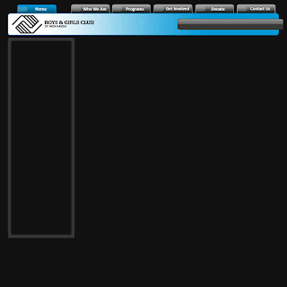
 Then the header was moved to the top of the page and the contents was cleared in order to be input in Yahoo Sitebuilder. That way the Club could change that text if they wanted to. I also adjusted the size of the template and added space for a mission statement under the big picture box. This was done at the request of the Club.

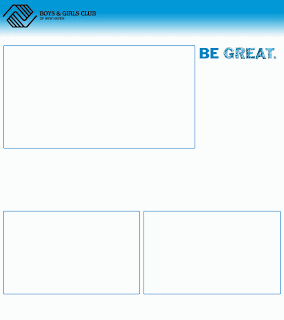
Then I experimented with some white designs to give them a comparison point
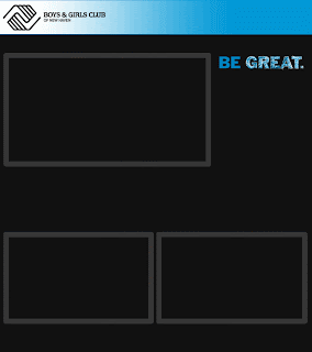
Went back to the black background but kept the boxes outlined in the sky blue.
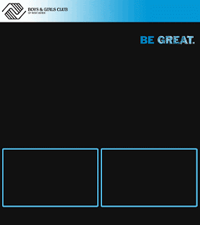
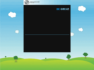
 Finally, the two bottom boxes were cleared and a single thin line was incorporated. The header box's color was also adjusted to blend more with the background of the site. This was the final homepage template design.
 PAGE TEMPLATES:
The changes in page template followed the homepage changes for the most part
The sidebar box was adjusted and the header moved to the top of the page
 The sidebar box became yellow in order to use more color. This is the final page template design.
BACKGROUND WORK (the space around the template)
The background was a tricky piece of the puzzle. At first the background was set to a darkish gray, but the site came off very drab... not really kid friendly. So then I had the idea to give it a splatter paint look... I deleted most of the attempts, but here is one that survived:
 I really liked the concept of this, but after trying again and again to get it the way I wanted, it just wasn't coming out as well as I wanted it to. So I explored other options, but this is an idea I hope to return to in a personal project. Searching around for ideas brought me to an image designed by another graphic designer. I emailed him and he said it was fine to use it for the site and asked if I could include his website in the HTML in exchange.
The other photoshop work I did was in making the navigation bar buttons. I originally made the entire bar in photoshop and then realized that Yahoo Sitebuilder had other plans for me. So I went back and saved the buttons individually and worked them in using the NavBar creator. I made one inactive button, one rollover, and one active. Here they are individually:


The side bar buttons are on that yellow background so one of them is white and won't show up here, but here is the green rollover button:

My biggest challenge came in the form of the homepage slideshow. I tried importing a flickr slideshow but the result wasn't as professional as I wanted it to look. Whenever the user rolled their mouse over it, controls would show and it would link back to the flickr account. I tried making a movie in windows movie maker, but once again I had trouble with controls showing and the show not automatically starting when arriving at the page. Finally I gave in and learned how to use Adobe Flash. I ended up making a swf file but I couldn't import a swf into Yahoo. So I tried saving it as all sorts of different things: animated gif, wav, avi, etc., etc., I did a lot of Google-ing to try to find a solution. I came across one that said I could use the HTML from the swf file and insert that into Yahoo. So I opened the swf with Firefox which created another version of the file. Then I opened that version in notepad and lifted the HTML from there. Next I uploaded the swf to my Yahoo file manager and inserted the HTML in the Sitebuilder application. It took a while, but I got it to work!
Other features include the linked donation buttons which send users to a secured site to make donations through. I didn't have anything to do with the creation of the outside account, I simply created the button and link. Also, Yahoo has quite a few features built into the sitebuilder application. I added the Yahoo directions box really easily along with the contact us form and a registration form that is not being included right now. Both of the forms are linked to an email address which stores whatever people submit. Lastly, the color scheme was chosen to match the landscape background in addition to the Boys & Girls Club of America marketing guidelines.
For right now, the site can be found at www.joannaclarkmarketing.com. I'm not sure how long I'll keep it up there, but for now it has been useful while I design and the Club director looks over progress.
All-in-all I'm really glad this project fell into my lap. It still hasn't been decided if the site will actually be adopted by the Club, but even if it isn't, I'm really happy with how it has all come out and I feel much more comfortable and capable with my abilities. I hope to create a personal site in the future, and I imagine the process should go a bit more smoothly.
The homepage and page templates went through metamorphoses:
 This was the original homepage design
 Then the header was moved to the top of the page and the contents was cleared in order to be input in Yahoo Sitebuilder. That way the Club could change that text if they wanted to. I also adjusted the size of the template and added space for a mission statement under the big picture box. This was done at the request of the Club.
Then I experimented with some white designs to give them a comparison point


Went back to the black background but kept the boxes outlined in the sky blue.

 PAGE TEMPLATES:
The changes in page template followed the homepage changes for the most part

The sidebar box was adjusted and the header moved to the top of the page

BACKGROUND WORK (the space around the template)
The background was a tricky piece of the puzzle. At first the background was set to a darkish gray, but the site came off very drab... not really kid friendly. So then I had the idea to give it a splatter paint look... I deleted most of the attempts, but here is one that survived:

The other photoshop work I did was in making the navigation bar buttons. I originally made the entire bar in photoshop and then realized that Yahoo Sitebuilder had other plans for me. So I went back and saved the buttons individually and worked them in using the NavBar creator. I made one inactive button, one rollover, and one active. Here they are individually:
The side bar buttons are on that yellow background so one of them is white and won't show up here, but here is the green rollover button:
My biggest challenge came in the form of the homepage slideshow. I tried importing a flickr slideshow but the result wasn't as professional as I wanted it to look. Whenever the user rolled their mouse over it, controls would show and it would link back to the flickr account. I tried making a movie in windows movie maker, but once again I had trouble with controls showing and the show not automatically starting when arriving at the page. Finally I gave in and learned how to use Adobe Flash. I ended up making a swf file but I couldn't import a swf into Yahoo. So I tried saving it as all sorts of different things: animated gif, wav, avi, etc., etc., I did a lot of Google-ing to try to find a solution. I came across one that said I could use the HTML from the swf file and insert that into Yahoo. So I opened the swf with Firefox which created another version of the file. Then I opened that version in notepad and lifted the HTML from there. Next I uploaded the swf to my Yahoo file manager and inserted the HTML in the Sitebuilder application. It took a while, but I got it to work!
Other features include the linked donation buttons which send users to a secured site to make donations through. I didn't have anything to do with the creation of the outside account, I simply created the button and link. Also, Yahoo has quite a few features built into the sitebuilder application. I added the Yahoo directions box really easily along with the contact us form and a registration form that is not being included right now. Both of the forms are linked to an email address which stores whatever people submit. Lastly, the color scheme was chosen to match the landscape background in addition to the Boys & Girls Club of America marketing guidelines.
For right now, the site can be found at www.joannaclarkmarketing.com. I'm not sure how long I'll keep it up there, but for now it has been useful while I design and the Club director looks over progress.
All-in-all I'm really glad this project fell into my lap. It still hasn't been decided if the site will actually be adopted by the Club, but even if it isn't, I'm really happy with how it has all come out and I feel much more comfortable and capable with my abilities. I hope to create a personal site in the future, and I imagine the process should go a bit more smoothly.
Friday, April 22, 2011
Like the Back of My Hand
Photoshop Exercise 5
DESCRIPTION: Create an 8 x 8 inch flyer using color and a grid system to direct the viewers’ eye and to establish visual hierarchy. Select various tools and strategies from Photoshop to develop your composition. For instance, color shapes at various opacities can be added as another layer of information or parts of one image can be cloned into another. Attention will be given to effective use of typography, line, image, figure/ground relationships (open space) and experimentation. Use the whole page. Make sure your document is RGB and properly resized for the web before saving as a jpeg and uploading to the blog.
Process:
1. Write a set of facts about your life, and create a photographic image of your hand. Other images can be used but your hand should be clearly represented.
2. Map your life onto the image of your hand. Position each element on a 30 or 45-degree angle. Use scale, position, color and transparency to organize the information to create visual interest.

Informational Graphic: The Diagram
Communication Design Project 3
DESCRIPTION: Using gathered facts design a creative and resourceful informational graphic. This could be based on your logo just created. The information presented will allow us to see relationships both in the content and the form. Time and motion should be considered as well.

Animation
Photoshop Exercise 4
DESCRIPTION: Create a short animation in Photoshop using type and image giving special attention to sequencing and transitions in terms of communicating a certain feeling or response in the viewer. For instance, transitions with a long fade in or fade out allow the viewer to spend more time with each sequence, or frame, and have a softer visual voice. Transitions that are direct have a louder voice. Sometimes visual interest can be created in juxtaposing these two ideas.
Motion, Time, Sound
Communication Design Exercise 3
DESCRIPTION: Create a composition using points, lines, and planes that implies motion, time, and sound.

Subscribe to:
Comments (Atom)